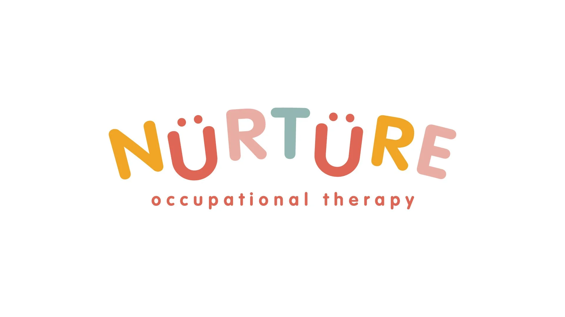
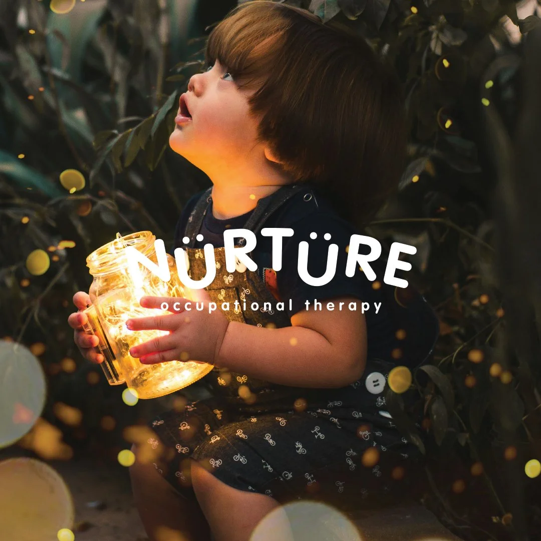
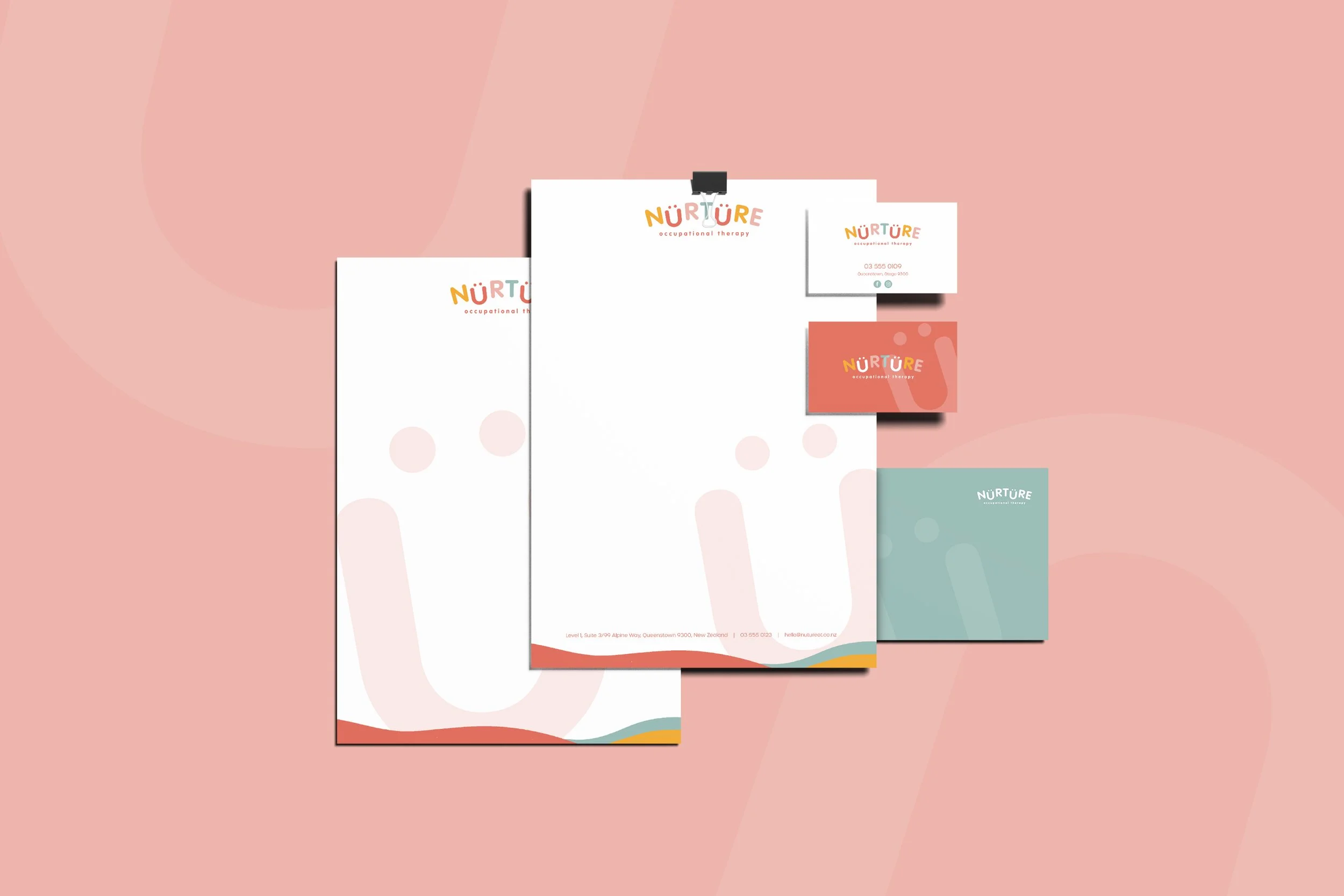
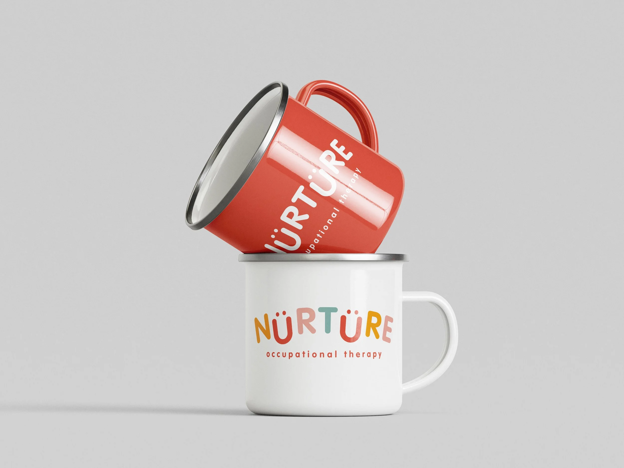
Nurture Occupational Therapy
This branding project for Nurture Occupational Therapy centres on the power of play as a foundation for growth. The practice takes a child-led, strengths-based approach, supporting each child to build independence and participate confidently in everyday life — from home and school routines to social connection and self-care. I wanted the identity to reflect this sense of encouragement and possibility, capturing the warmth, patience, and positivity that sit at the heart of the service. The visual identity balances calm professionalism with a playful spirit. A soft, split-complementary colour palette introduces warmth and approachability, while still feeling considered and cohesive. The rounded, gently irregular letterforms bring a child-friendly energy, contrasted by clean typography that grounds the brand in trust and expertise. The result is an identity that feels supportive, reassuring, and optimistic — a brand that speaks equally to children and the adults who care for them.

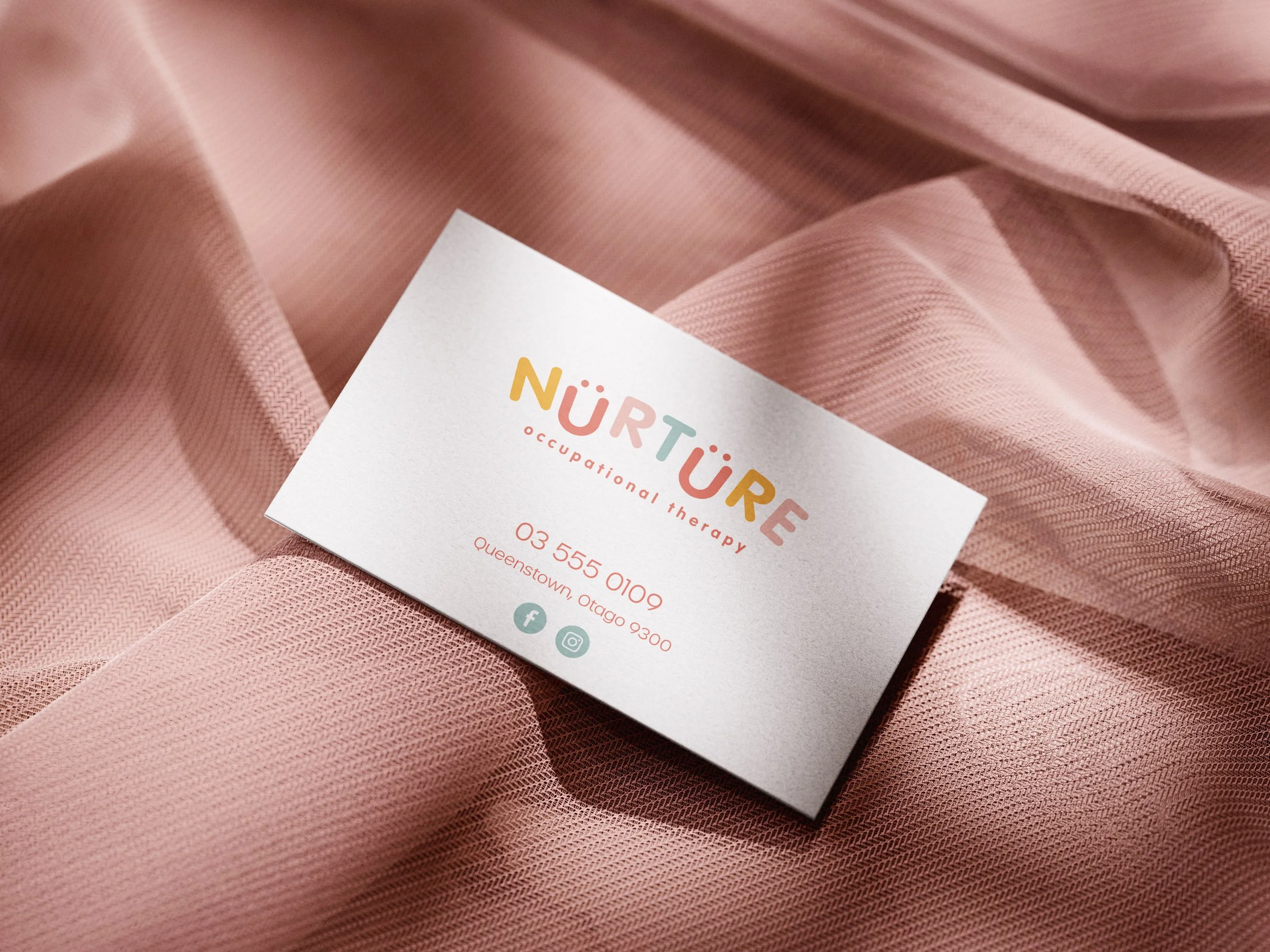
Yui perfectly captured the heart of my children’s OT business. I asked for calm yet playful vibes and with her recommendation of split-complementary colours (orange, pink and green), she delivered something even better than I imagined.
The final design feels warm, child-friendly and professional all at once, which is exactly what I was hoping for. I’m so thrilled with the result and have had so many positive comments on it already. I highly recommend Yui to anyone wanting thoughtful, beautifully executed design work.
— Nina Dockendorff